Simon Frankau's blog
Recreating the NTK 31337/Elite t-shirt
One of my favourite t-shirts is the old NTK Elite t-shirt. My wife has pointed out it's a bit grubby, and needs replacing. I thought she might just be jealous of a t-shirt I've known longer than her, but I think she does have something of a point.
Having recently experimented successfully with custom t-shirt printing, I thought I could create myself a replacement. And that's what I did. A pixel-based design is fairly easy to copy, although getting the measurements of the wide-open spaces was something of an estimation. I tried to keep in the infelicities of the original design, keeping it as close to the original as possible.
One thing I hadn't realised originally is that the main screen is a simple 256 pixels across, but the strap-line at the bottom isn't on the same resolution (which can be checked simply - there are more than 32 8-pixel letters). In order to keep the whole design as a simple low-resolution image, I rejigged the bottom, squashing a few spaces to fit into a 256-pixel-wide image, and I must admit I'm pretty happy with the result.
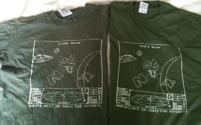
The resulting t-shirt, next to the original, for comparison, looks like this:

Overall, I think it looks pretty good. The placement is about right, the colour of the shirt is fine. The image isn't quite as wide as the original. I thought I adjusted the size to match what I measured from the original... perhaps it was slimmed to fit into the bounds of their printing mechanism? Ho hum. In any case, I'm pretty happy with it.
Posted 2015-04-13.